
By and large, in Meta Ads the result depends on the creative more than on the settings. If Meta Ads is one of the main traffic sources today, then the growth of the whole business depends on your creatives.
A beautiful layout collects likes in the team chat. A crooked video shot on a phone brings paying customers cheaper. Everyone who has run ads has seen this at least once, and every time it surprises them as if for the first time.
I asked myself: why does this happen, and can it be caught before launch rather than after the budget is spent? There was little honest material: plenty on “how to draw it” and almost nothing on “what to say”. So I assembled this guide from my own archives: creative reviews, notes from lectures and webinars, conversations, research-based techniques from an article on vc.ru (in Russian), and seven ads that look strong to me.
Inside: 4 success/fail pairs, 7 breakdowns of live creatives, 13 diagrams, a “weaker → stronger” table, 9 techniques from research, a hypothesis template and a pre-launch checklist.
Let’s go in order.
1Beauty and conversion are measured by different metrics
Design is judged on form: composition, light, harmony. An ad creative is judged on mechanics: which barrier it removes, what the person does in the first seconds, and whether the offer hits their real situation. When aesthetics overshadows communication, the ad turns into expensive white noise.
The first pair. Both pictures advertise food delivery, and the success criterion is the same: target CPO (cost per order).
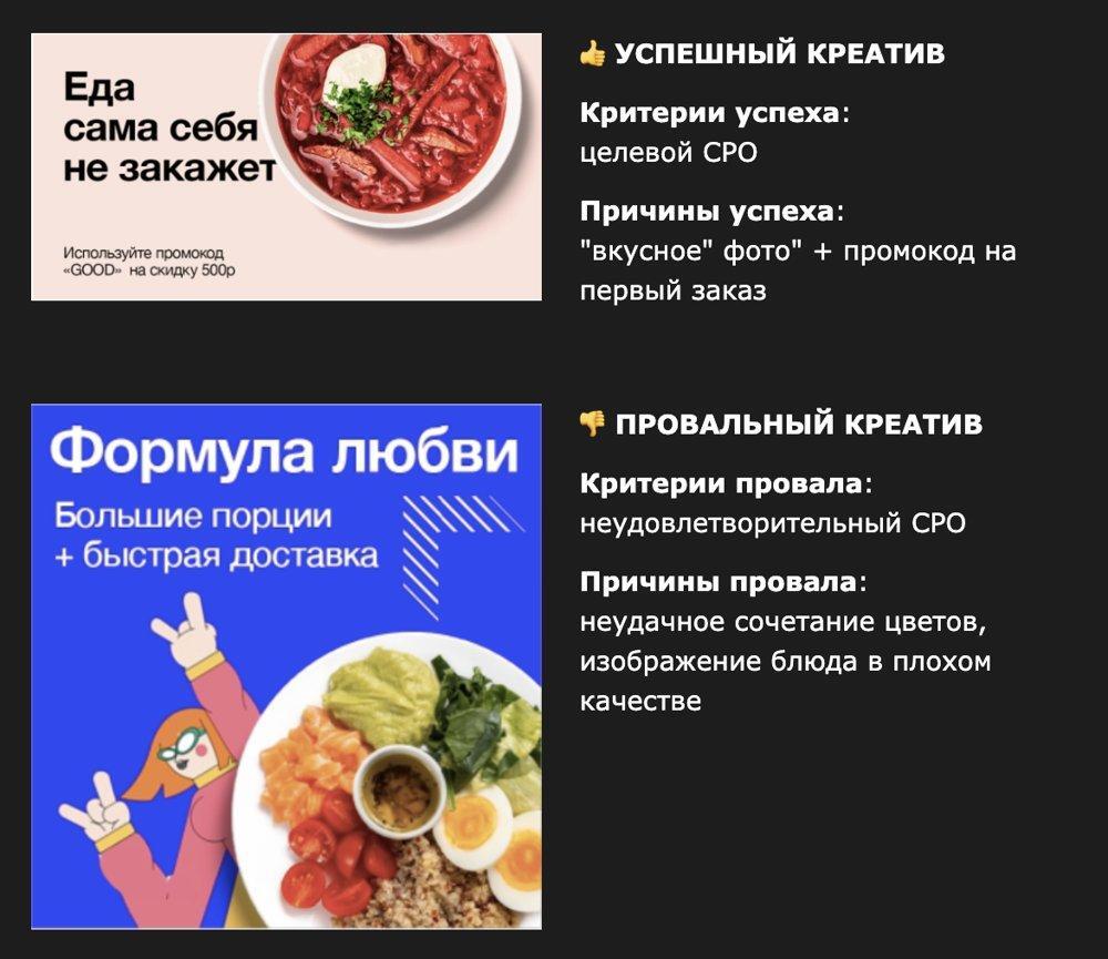
There is nothing in the successful version that can’t be made in an hour: food, one phrase, a promo code. The failed one looks more “conceptual” (a love formula, a character, a bright background) but doesn’t show the main thing: what the person wants to eat. I cover how a promo code and a discount change order economics in a separate piece: Price and sales: set it, raise it, discount it.
Insight: in all four pairs of this guide the success criterion is target CPO, or CPO within the project’s economics. Not one uses CTR.
2A creative starts with a situation, not a format
A common mistake is to start with “banner, video or UGC?”. The format answers “how to deliver”. The “what” stays unanswered. Any ad message is a chain of five links:
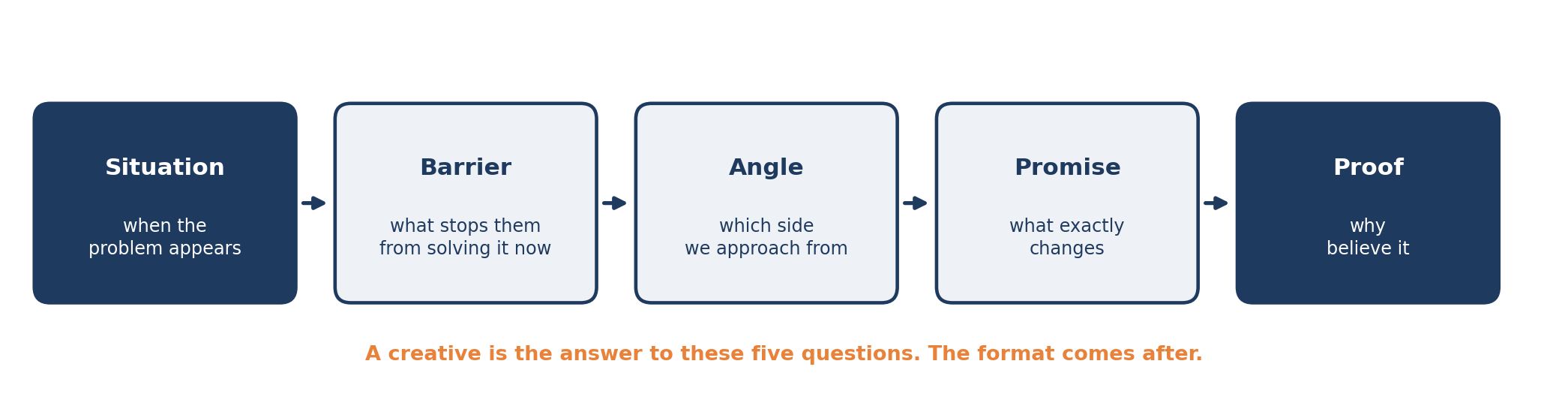
Creative used to be intuitive: the makers liked it and assumed people would too. Then came the data-based creative trend. The working position today is in the middle: data is needed to find the insight, while the idea and the execution are still made by a person.
A finished layout is easy to check with the ABCD frame:
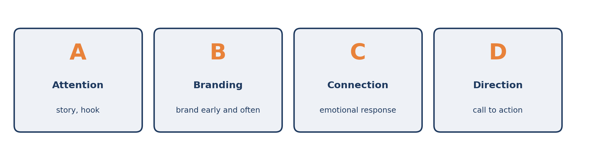
If a layout lacks at least one letter, I would ask why.
Promise and barrier. An ad for a pay-for-results influencer-marketing service removes the advertiser’s main fear in one line: “You pay only for sales”. That is the barrier (“what if it doesn’t pay off”) turned into a promise.
Proof. A promise without proof is just words. Proof comes in different forms. The service Adext shows the dynamics of metrics (ROAS and CPA “with Adext” and “without”) right in an animated chart.
The next two pairs are about the same thing: a person must understand what is being sold before they scroll past.

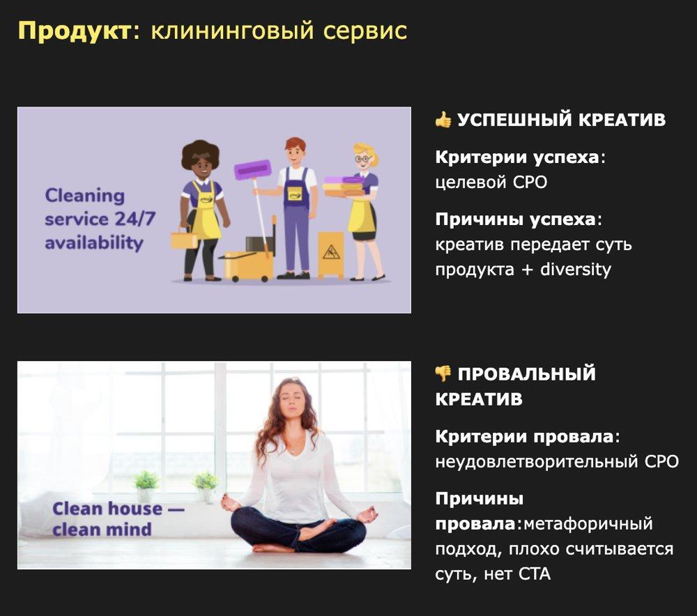
My takeaway from these two pairs: metaphor is a luxury for a brand people already know. A cold audience needs the literal.
3A creative is a filter, and CTR is a trap
High CTR comes from clickbait, a pretty picture unrelated to the product, memes and abstract offers. The person clicked out of curiosity, landed on the page, didn’t find a solution to their problem and closed the tab. The money is spent, the funnel is empty.
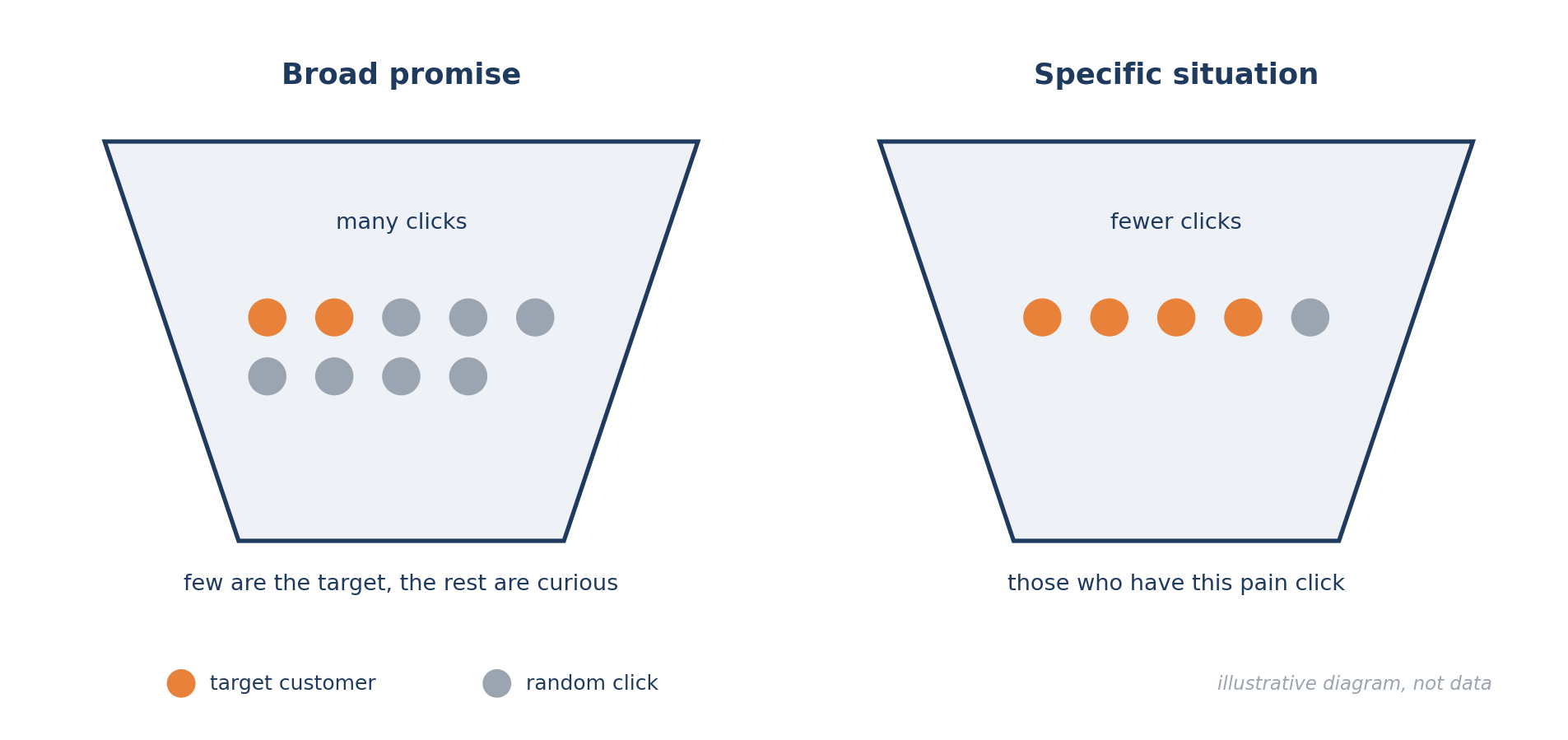
A hypothetical example for a report-automation service. Ad one: “Run your business more efficiently with AI”. It fits an entrepreneur, an analyst, a tech enthusiast and anyone simply curious about artificial intelligence. Ad two: “Every Friday you merge payments from several spreadsheets by hand? Automate the report”. It gets clicked by the one for whom this really happens every Friday.
That doesn’t mean the second one will necessarily win: the promise must match the product, and the audience must have the need and the money. But it gives a concrete reason to click. The fourth pair shows the filter in its pure form.

The same four pairs as text, plus the AI example from this section. Weaker on the left, stronger on the right; look at what exactly was replaced.
| Weaker | Stronger | What changed |
|---|---|---|
| “Love formula: big portions + fast delivery” | “Food won’t order itself” and a promo code for the first order | Instead of an image and two properties: food in the frame and one action |
| “Boost your business with express delivery” | “Faster than ever. Delivery in Delhi in 90 minutes” | Instead of a generic “speed up your business”: a place and a time |
| “Clean house — clean mind” | “Cleaning service 24/7 availability” | Instead of a metaphor: the name of the service and the schedule |
| “Art knows no borders” | “Find out how the world of Hayao Miyazaki sounds” | Instead of an abstraction: a specific event and a specific viewer |
| “Run your business more efficiently with AI” | “Every Friday you merge payments from several spreadsheets by hand? Automate the report” | Instead of any entrepreneur: a situation that happens to a specific one |
Make decisions to stop or scale by the campaign goal: cost per order, lead quality, final conversion. CTR and CPC are intermediate indicators, not a verdict.
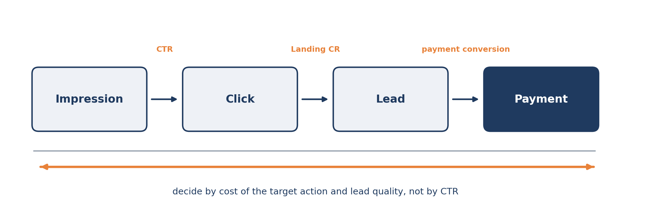
But low conversion after the click doesn’t prove the creative is to blame either. The cause may be the landing page, the price, the product, the checkout, traffic quality or analytics setup. A creative is part of the acquisition system, not a standalone banner. How to count marketing and sales as one shared result I covered here: Marketing and sales: managing one shared result.
One more thing on measurement. On a conference slide I photographed, three conclusions read like this: if you have many purchases from existing users, without cohorts there will almost always be an error; if you have many sessions per user or orders per lead, be careful with Ecommerce Conversion Rate (it will be either higher or lower than the real conversion); if you really want to use modeled conversions, double-check yourself, because it is never clear how much extra they added to your campaign. A creative can’t be honestly judged on broken analytics.
4Hook and text structure: what to say in the first seconds
Basic rules for posts and text ads that I collected from practice:
The picture is there to attract attention, not to explain.
Start a sentence with 1–2 words to pull the reader onto the “slippery slide”.
Start with an interesting fact or a question, then give the solution that follows logically from it.
List benefits in short bullets.
Give the call to action with a benefit: a discount, a specialist consultation.
Emoji in the text, text split into paragraphs.
Try different entries: humor, solving a problem, provocation. For provocation and other content techniques I have a breakdown in English: 16 non-obvious content marketing tactics.
A hook in three layers. A hook is made of three parts, and all three must carry one thought. The phrase: the first words of the video, a ceiling of 12 words, better 5–8. The first frame: what is visible in the first second; it must read without sound, so start mid-action, with one focal point, no splash screen and no logo. The on-screen text: up to 6 words, an accent or a number, not a repeat of the phrase. If the layers are about different things, the hook catches and then the video gets abandoned. For an image and a text ad this compresses to three things: the picture, the first line (the point within the first 35 characters) and the headline.
Next, rules from the Kumar & Solo skill set (Creative System: creative review, hook generator, video script). I read all three and took what is easiest to apply by hand.
The hook type depends on what the person already knows. By Eugene Schwartz’s stages of awareness: doesn’t know about the problem, so a story, a pattern break, an address to “your own people”, but not the product itself. Knows the problem: pain, recognizable symptoms, the cost of inaction. Knows the ways to solve it: a comparison of ways, “why X doesn’t work”. Knows the product: proof, before and after, a testimonial. Ready to buy: the offer, the deadline, removing the last objection.
You need a pack of hooks, not one. 12–15 variants, no more than three of one class (pain, loss, intrigue, story, address to “your own”, broken expectation, number). Three to five from different classes go into the test: the platform will show five phrasings of one idea to the same people, and you will learn about one idea instead of five.
Moderation. Don’t assert anything about the viewer themselves (money, health, age, debts): platforms cut that. Instead of “Do you have debts?” write in the first person: “I sat without money for a year until…”. Better not to start with “Introducing”, “Meet”, “Are you looking for…?”, a brand name or “Stop! Don’t scroll!”.
How to tell a winner. In the creative review, a winner is an ad with 8,000+ impressions and a cost per lead within target. A false winner: leads are cheap but brought in less money than was spent, or the ad lived less than 7 days. A hook variant “helps” if the lead with it is cheaper by a quarter or more, and “hurts” if it is more expensive by a third or more.
For a talking head the authors rely on an analysis of 5,027 Russian-language Reels. Fit the hook into 6–9 words. Strong videos more often contain a provocative statement (1.23 times more often than weak ones) and a promise of a result, and less often a question (×0.80) and a number-fact (×0.30). A question works if it is about the viewer’s situation, not an abstract one.
This is the empirics of the set’s authors, not laws: treat the thresholds as a starting point, then check on your own traffic. And read any hook aloud: if it sounds like an ad, rewrite it.
“That’s me” questions. The guys at Qmarketing make banners that ask “Want to become a marketing director?”. Such questions, by their account, convert well: the person qualifies themselves.
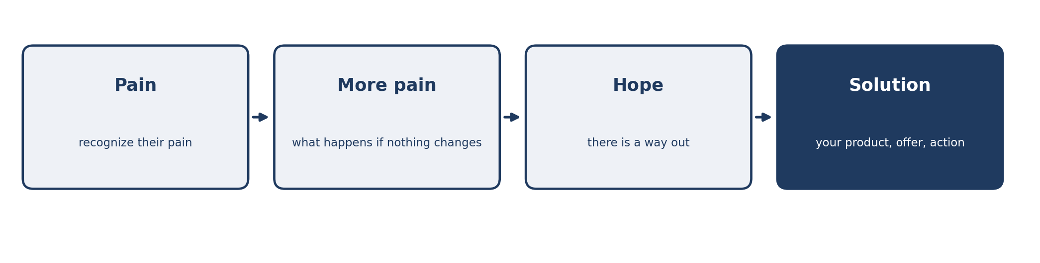
Pain → More pain → Hope → Solution. One of the classic structures of a selling text, especially in B2C and info-business:
The story from the side. On how to present the offer, there is a rule I remembered in these words:
Better not so explicitly, come in “from the side”, through some understandable story. For example: “There are fewer state-funded places this year than ever, not everyone will get in”. A story that leads up to the sale. And selling head-on like that is better about two weeks later, when all the other ways are exhausted. Otherwise you will lose most of the audience on day two.
Words of a practitioner who buys ads
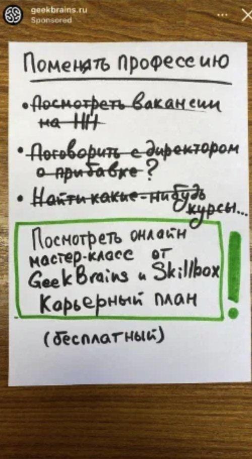
A native example of a “story from the side”: a GeekBrains story ad styled as a handwritten note. A situation (“Change profession”), three crossed-out “wrong” steps (look at vacancies on HH, talk to the boss about a raise, find some courses) and the solution in a frame: “Watch an online masterclass from GeekBrains and Skillbox. Career plan (free)”. It looks like a note, not an ad, and the word “free” comes last and removes the risk.
Conflict with a stereotype and a named person. The school Skvot starts with the thesis “not ‘make it like Apple’”, then names who teaches (an art director of a design bureau), and only then shows the school’s name. The conflict catches, the name proves.
The product is shown, not described. In a Skillbox ad, words go one per frame (“boring”, “processing”, “COURSE”) alternating with a recording of a real screen: a table, a chart. Two seconds to understand what exactly the course is. And Setters Education builds its video on large type and colored blocks: “Level up in working with content and building strategy”, “4 speakers”. Everything reads without sound.
FOMO is a working lever, with a caveat. Here is how the mechanics of online schools were described:
In short, the point of it in marketing is that there is some secret, but you don’t know this secret, so your results are not great, and it could be 100 times better. So you need to buy this method, otherwise you’ll stay an outsider. And you have to act, of course, urgently, because the opportunity is about to go.
Words of a practitioner who buys ads
The same words continue with an honest question: is there a secret at all? Most often there isn’t, or it doesn’t match the promises. My filter: if a promise won’t survive meeting the landing page and the product, it doesn’t go into the launch. That kind of ad burns trust faster than money.
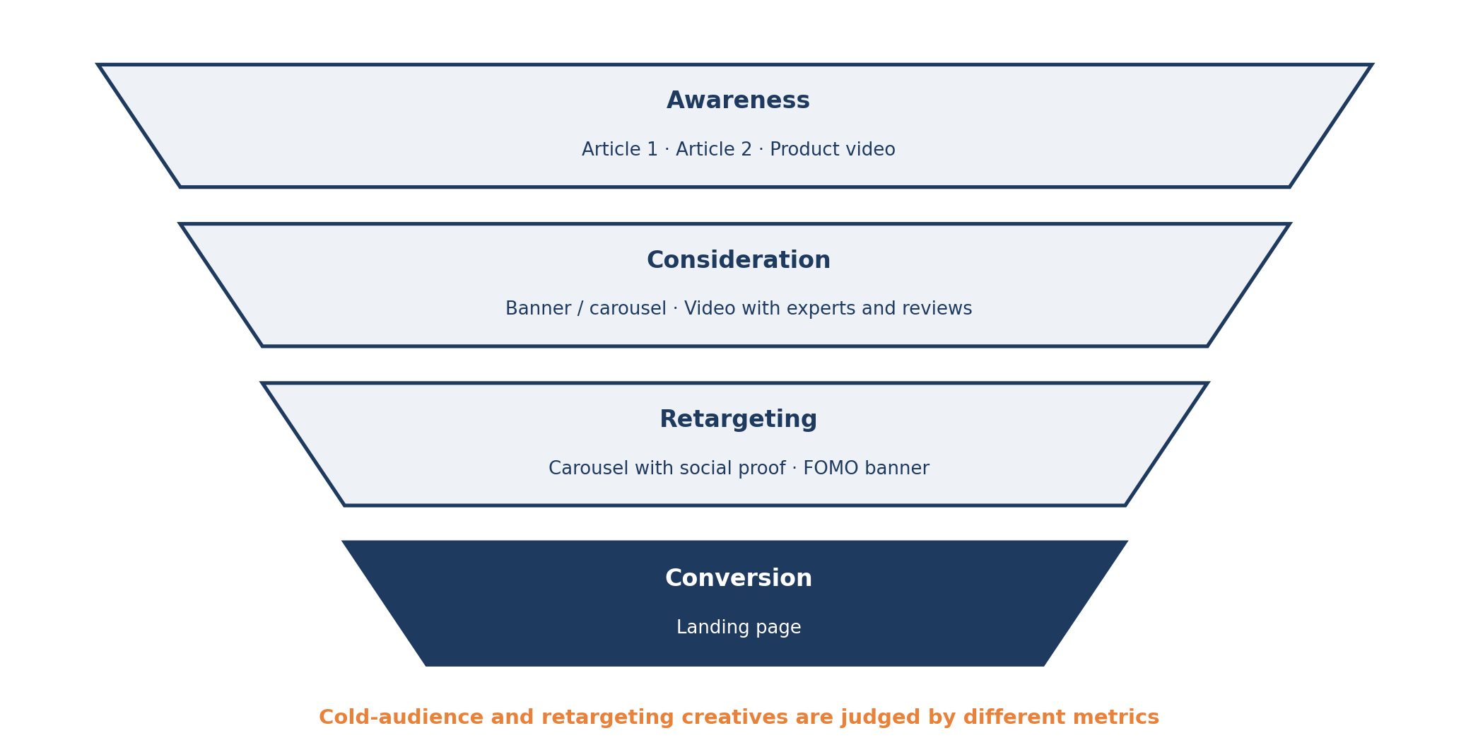
5One creative does not take a person from stranger to purchase
A creative for a cold audience and a creative for retargeting solve different tasks and are judged by different metrics. For complex B2B products and new products, on one lecture slide the chain looked like this:
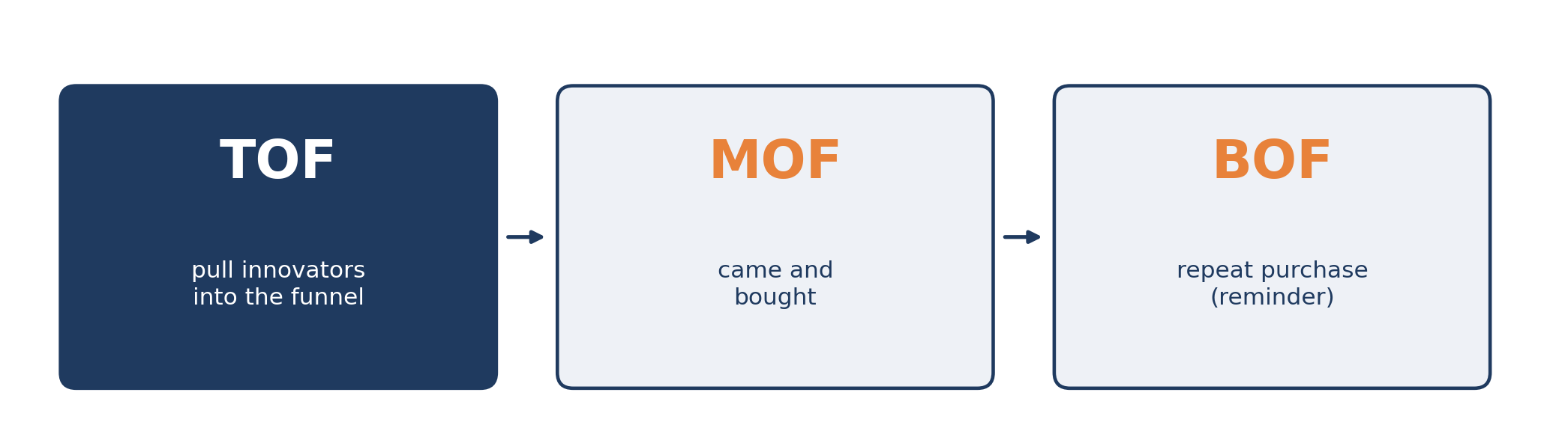
On another slide, which I photographed on Instagram, the same logic in TOF/MOF/BOF terms: at the top of the funnel, pull in the innovators; in the middle, “came and bought”; at the bottom, a repeat purchase (a reminder).
For retargeting I would test the push-to-buy separately. There are many ways: a special offer, a plain reminder, moving into another funnel, a deadline, a reminder of the benefits, an offer of a call. Here is how practitioners put it:
A client leaves a request and gets a triggered email sequence. There are many ways to push them: a special offer, just a reminder, send them to another funnel, press with a deadline, remind them of the benefits, offer a call, and so on. Which way will work better for which segments/products? I don’t know. But I know for sure: this is a great place to look for a good combination.
Words of a practitioner who buys ads
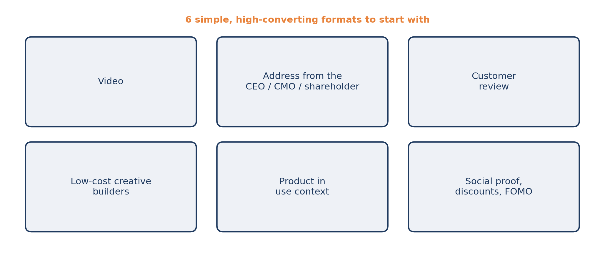
Simple, high-converting formats to start with: video, an address from the CEO/CMO/shareholder, a customer review, the context of product use, social-proof mechanics, discounts and FOMO, low-cost creative builders. A first-person address works as the “face of the brand”: in the example below it is the author himself speaking to the camera.
On builders and services that make it easy to assemble variations without a designer, I collected a separate breakdown (in Russian): Marketer’s tools: 17 services, what they do and where the catch is. And on short video as a format: A big guide to growing a blog on YouTube, Rutube and VK Video.
6Test meanings, not colors
Changing the background from blue to red and calling it a new test is pointless. What you test is angles: fear of loss versus benefit, saving time versus saving money, a customer testimonial versus a founder’s address.
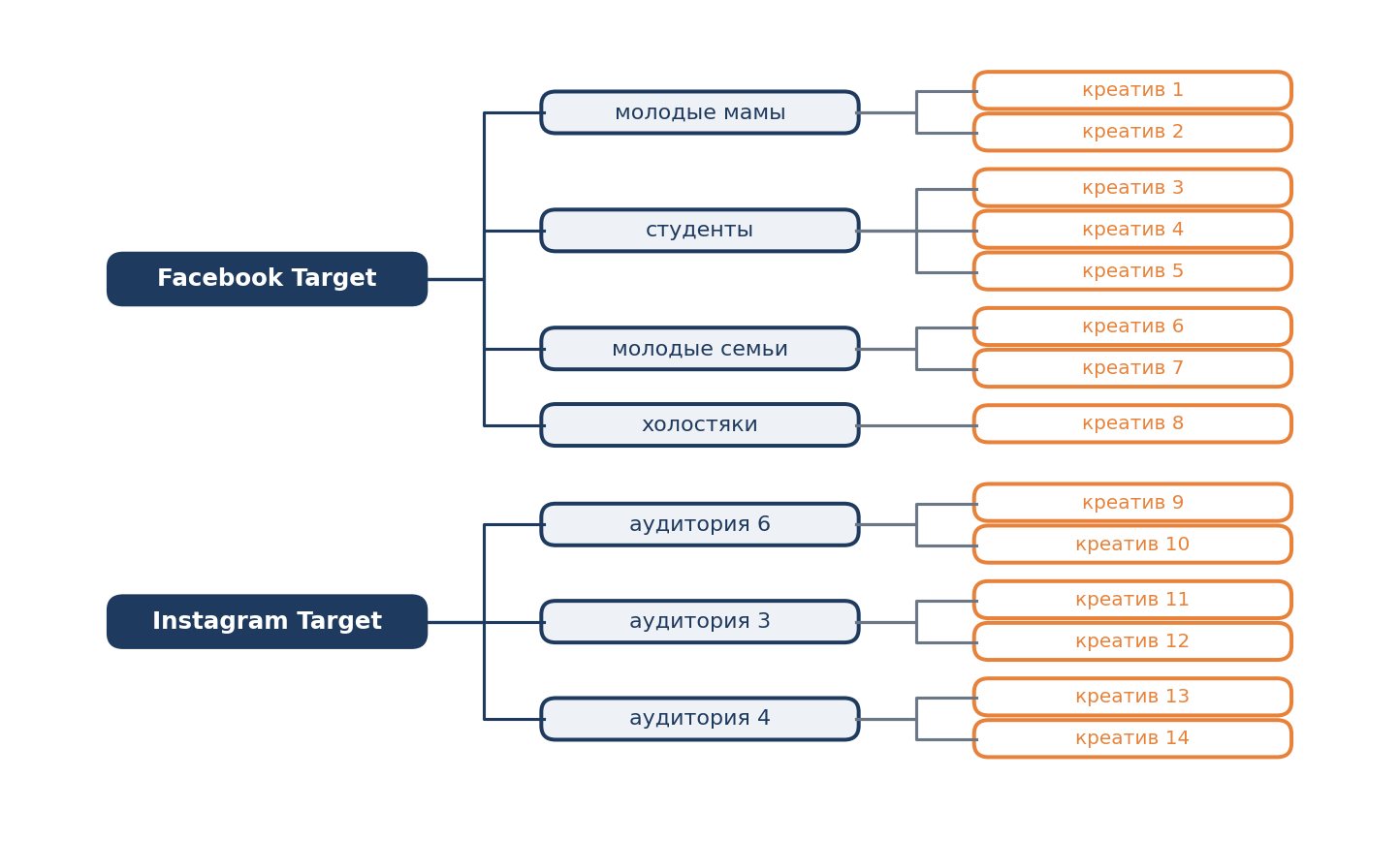
Practitioners describe the working cycle like this. Take one targeting, write a dozen ads for it (some universal, some for the specific targeting), set a minimal CPM and a small budget, run them in turn. Keep the ones that perform acceptably, stop the rest, and repeat. In the end you have several dozen tested ads, of which 2–3 show the best result, and the main budget goes only to them.
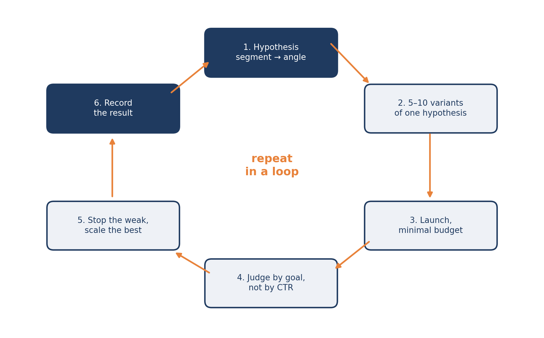
How to fill the cycle with ideas. An example I remembered, for an English school:
Why might people learn English? For business, for travel, for study. Make 10 different creative ideas for each of the 3 points. That’s 30 in total. Put them into rotation. Out of 30 banners, 2–3 will give a super result. Most will be average and a few downright bad. Keep those 2–3 and run only them. These are the combinations that work.
Words of a practitioner who buys ads
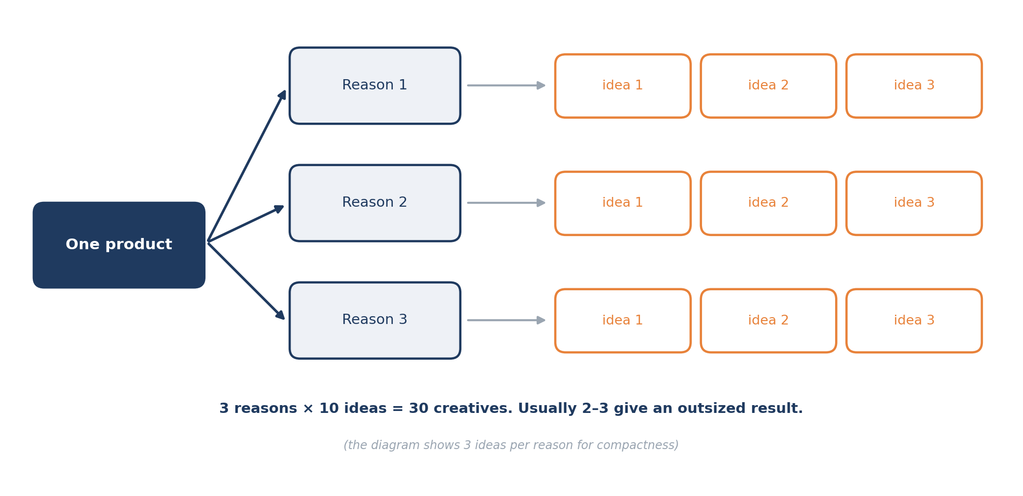
The same principle on a slide from a Tinkoff and Qmarketing webinar: each audience in Facebook and Instagram has its own branch of creatives, and above the tree are three steps. Research your customers again (how to find data for free: How to research a market for free: 48 authoritative sources), build a communication map, test hypotheses one after another and record the results.
Tip: record not only the winners. In a month you will remember the 2 best creatives and forget the 28 that were already checked and didn’t work.
7Repetition strengthens a message but doesn’t replace it
The illusory truth effect: the more something is repeated, the more we believe it. Repeat the key message (the main benefit, the distinguishing feature) again and again: in ads, on the site, on the App Store page, at sign-up, in emails. A catchy slogan you repeat long enough starts working on its own, and if it rhymes, even better.
Rhyme is not the only technique for a slogan. The popular Sunmag article on the psychology of advertising (in Russian) (2014) also describes antithesis: a short slogan built on opposition, for example “We work, you rest” (Indesit). It also has an honest limitation: persuasion works only if the person is already interested in the product. This is journalism, not research, so take it as a hypothesis to test.
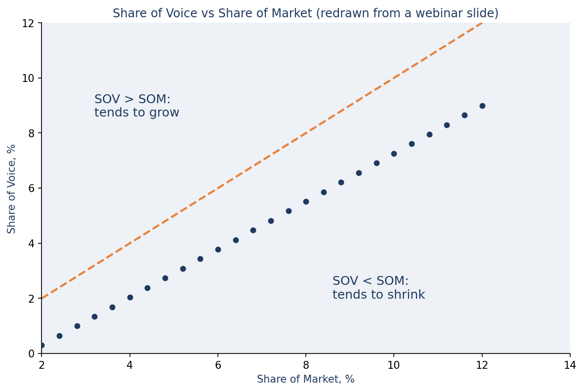
Presence is counted not only in repetitions but in share of voice. On a webinar slide that analyzed advertising after the lockdown, the logic is this: most companies cut marketing budgets, so you can increase your market share. If Share of Voice is higher than Share of Market, the tendency is to grow; if lower, to shrink.
A caveat: you can know everything about the audience, down to the nuances of its behavior during the day, but if the ad is banal, no matter how many times you serve it, there will be no effect.
8Small things that move metrics: 9 techniques from research
From 27 psychological techniques for the visual design of ads (a translation of Nick Kolenda’s article on vc.ru: 27 psychological techniques for the visual design of ads (in Russian)) I picked the nine that are easiest to test. An important caveat: these are effects from lab studies, not laws. Each is worth checking on your own traffic.
| Technique | Research | How to apply |
|---|---|---|
| Image to the left of the text | Grobelny & Michalski, 2015 | Put the graphic closer to the left side: the right hemisphere processes pictorial information better, so the message reads faster. |
| Product “ready to use” | Elder & Krishna, 2012 | The mug handle toward the dominant hand (usually right), cutlery on the right, the product out of the package. The effect disappears if the hand is busy. |
| Model’s gaze on the CTA | no link in the article | People follow gaze. Point the model’s gaze at the button, not at the viewer. |
| Attractive models only where they fit | Trampe et al., 2010 | Works for luxury, appearance, beauty, health. Doesn’t work for software, food, office supplies, furniture: it raises suspicion of manipulation. |
| Red for caution, blue for benefit | Mehta & Zhu, 2010 | Red is linked with danger (cavities), blue with “approach” (whitening). |
| Rhyme in the slogan or CTA | no link in the article | The article’s example: “Whaddya say, donate today”. Rhyme is remembered and feels truer. |
| Large logo | Pieters & Wedel, 2004; Wedel & Pieters, 2000 | Don’t be afraid to enlarge the logo: it raises attention to the brand. |
| Large emotional words | Pieters & Wedel, 2004 | Large type amplifies emotion, but takes attention away from the brand and the picture. |
| Rational appeals in new markets, emotional in established ones | Chandy, Tellis, MacInnis & Thaivanich, 2001 | A new product needs explaining. A known one can play on feelings. |
9Neural networks and automation: what they do for you and what they don’t
Ad accounts and platforms (Meta Advantage+, TikTok Symphony, Google Asset Studio in Performance Max and others) offer tools for generating and adapting creatives: resizing to formats, variations, background extension, assembling video from product assets, translation and dubbing. The feature set and availability in your region change quarter to quarter, so check the platform’s own documentation, not reviews.
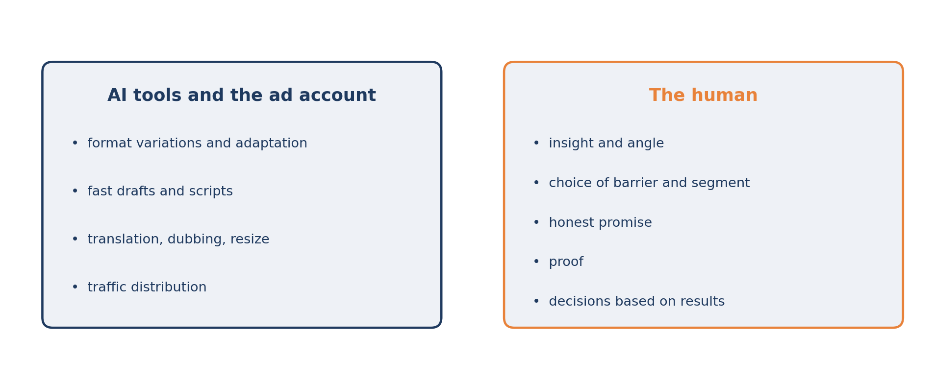
What doesn’t change: the algorithm distributes traffic but doesn’t invent meaning. If you feed the system ten visually different but identical-in-essence creatives, it will find the cheapest click among an irrelevant audience. Variety should be in meanings and formats, not in shades.
10Typical mistakes
Testing a color instead of testing a meaning.
Judging by CTR instead of the campaign goal.
A vague brief: “make it modern and premium”. Replace it with three questions: what task the layout solves, what one thesis reads in 2 seconds, what action should follow.
A promise the landing page doesn’t confirm.
Ten versions of one idea instead of three different ones.
Metaphor for a cold audience.
Test results not recorded.
Template: the creative hypothesis matrix
Fill it in before you brief the designer. If you can’t fill in a field, it’s not a design problem but a problem of understanding the customer.
| Field | What to enter | Example |
|---|---|---|
| Segment | Who exactly | Small business owner |
| Situation | When the problem appears | Merging reports eats evenings |
| Barrier | What stops them from solving it | Fear of complicated integration setup |
| Angle | Which side we approach from | Give the evenings back to the family |
| Promise | What exactly changes | Reports without programmers |
| Proof | Why believe it | Setup in 60 seconds on a screenshot |
| Action | What the person does | Click “Try for free” |
| Success metric | How we’ll know it worked | Cost of the target action, not CTR |
Pre-launch checklist
It’s clear who it’s addressed to, and this is visible in 2 seconds.
One main thesis, not five.
A hook in the first seconds or the first line.
The brand is visible early.
There is proof: a number, a testimonial, a name, a demonstration.
A call to action with a benefit.
The promise matches the landing page.
The creative differs from its neighbors in meaning, not in color.
The decision on the result is tied in advance to the goal metric, not to CTR.
The test result will be recorded.